The Breakdown
3 words that matter to parents
In 1858, Florence Nightingale had a distribution problem.
Colin Elefante-Smith · 2026-08-05 · 4 min read
In 1858, Florence Nightingale had a distribution problem.
She'd already put the Crimean mortality numbers in front of the government. Tables, appendices, official reports. The finding was damning: far more soldiers were dying of disease than of wounds.
The tables went nowhere.
So she redrew the exact same data as a colored wedge diagram and privately printed 2,000 copies. Her reasoning, in her own words, was that the appendices only ever reached "scientific men." The picture was for what she called "the vulgar public."
Same numbers. Different format. Only one of them got read.
First Day is running that play in a Meta feed.
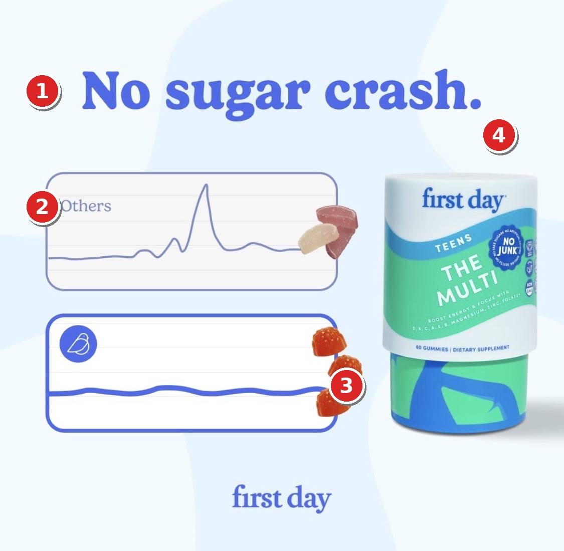
## 1. Congruence between the headline and visual
Three words at the top, and they're the ones that matter to parents (the actual customers for this product)
"no sugar crash."
Notice the nuance here. They don't say "no sugar", because that would be a lie. First Day's teen gummies carry 2 grams of added sugar per serving.
Instead, the headline skips the technicalities and gets to the heart of what actually matters. Every parent has dealt with their kids coming down off a sugar high at some point.
This is a claim about an outcome. Nobody's arguing over 2 grams vs 0 grams if the result is the same.
The chart reinforces the benefit in design language. Spiky line up top for the competitors, calm, smooth line below. You've only read 3 words and you already know why you should buy.
Few people will want to dig into the data, which is why First Day doesn't lead with it.
## 2. Positioning against "others"
Nobody gets named. So the reader fills in the blank with the bottle that's already sitting in her cabinet.
Naming a competitor puts a ceiling on the ad. Leaving it blank means the villain is whatever this audience already regrets buying.
## 3. The color and lines are doing subtle work
The competitor gummies are dull maroon and beige. Scattered like somebody dropped them carelessly.
First Day's are saturated orange, glossy, and stacked in a rising diagonal. Same category, completely different appetite response.
And notice the waves on this canvas. The spike up top. The ripple below it. Soft morph shapes in the background instead of a flat color. Even the gummies sit on a curve.
None of it lines up with anything else, and that's the point. The feed is a grid of rectangles, so a canvas of competing curves reads as WRONG in a way your eye has to stop and resolve.
Diagonals like these grab you because almost nothing in a room is diagonal (doors, windows, floors, walls, all perpendicular). Mix in the high contrast colors and you've got an image that's begging for extra attention.
## 4. The pack resolves the product details
The mockup on the right isn't just visually striking. It's also answering important questions about the product (namely "what is this?" and "who is it for?")
All together, the whole composition guides your eyes from the headline, to the chart, to the product. Everything gets resolved in under 2 seconds.
## How I'd beat it
Two tests I'd run against this control:
**First, label the flat line with a benefit.**
The whole ad is an absence right now. No crash, and nothing anywhere about what the kid actually GETS. "Boost energy & focus" sits on the pack at about 6pt, which means nobody has ever read it. I'd put the outcome on the line itself. "Steady through 6th period" instead of "no crash," because one of those is a thing a mother can picture at 2pm on a Tuesday.
**Second, kill the second logo and sell the bottom third.**
There's a "first day" wordmark at the bottom of the canvas, and the identical wordmark is already on the pack. That's a free zone paying rent twice. I'd fill it with proof. Their own site claims 98% of parents saw improved health and 83% saw better mood and motivation for school, so run a row of benefit callouts or a "Loved by 10,000 parents" line down there. Let the bottom of the ad close what the top of it opened.
Chart visuals in ads are everywhere, and they can work across a bunch of categories.
But whether yours converts or just decorates the feed comes down to whether the CLAIM sitting on it is one your buyer already believes.
---
**Want this done for your brand?**
One call will show you where your creative is leaving money on the table.
[Book a call](https://cal.com/colinelefante/ad-oven-discovery-call)