The Breakdown
One static = mini landing page
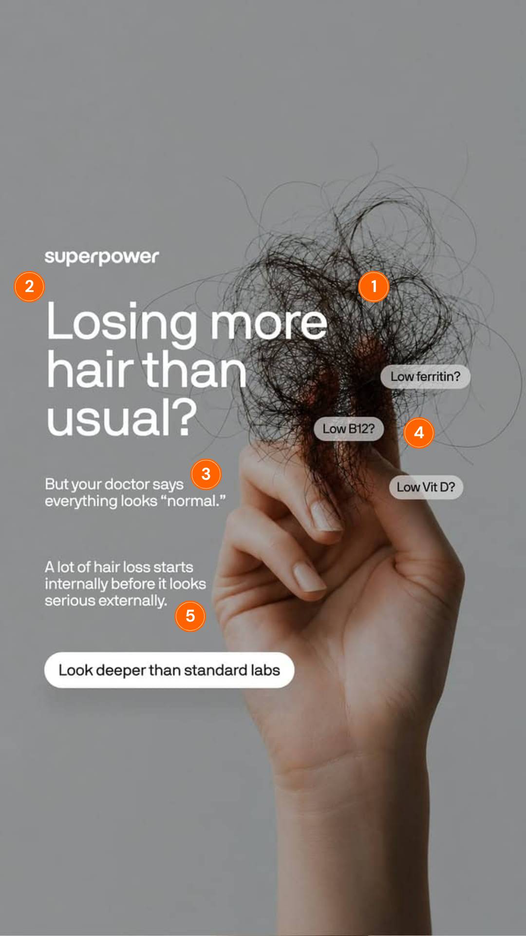
You already know a great static can do the job of an entire landing page. This Superpower ad is a clinic in it. Five moves, one frame.
Colin Elefante-Smith · 2026-07-10 · 3 min read
You already know a great static can do the job of an entire landing page. This Superpower ad is a clinic in it. Five moves, one frame.
Think about who it's built for. Someone who's been shedding hair for months. They finally booked the doctor, sat in the chair, and got the most maddening answer there is.
Everything looks normal. Not "here's the fix." Normal.
So they're frustrated, still searching, and primed to believe the real answer is hiding somewhere the standard tests never bothered to look. Superpower built the whole ad around that exact moment. Let me walk through the landscape.
## 1. The hand full of shed hair
It hits before you read a single word. Unsettling on purpose. It stops the scroll cold and makes the problem physical, and discomfort you can feel beats a benefit you have to read.
## 2. "Losing more hair than usual?"
A hard qualifier dressed up as a question. If that's not you, you scroll right past. If it is? You've already leaned in. This headline isn't reaching for everyone. It's reaching for the ONE person who's going to buy.
## 3. "But your doctor says everything looks normal"
That one line does some HEAVY lifting. It validates the reader, agitates the frustration, and quietly pins the blame on standard medicine, the thing that already failed them. Which makes Superpower the ally. They're not selling against a competitor here. They're selling against the status quo.
## 4. Low ferritin? Low B12? Low Vit D?
Those floating callouts pull double duty. They make the cause feel knowable, like there's an answer sitting just out of reach. And they signal this company checks the stuff your doctor skipped. Specificity reads as credibility. (It always has.)
## 5. "A lot of hair loss starts internally before it looks serious externally"
That's the pivot. It drags the problem off your hair (where you keep staring) and onto your bloodwork (where Superpower wins). Accept that one sentence... and the CTA writes itself.
Five moves, one image: qualify, agitate, reframe, convert. "Look deeper than standard labs" only lands because the ad already convinced you the answer runs deeper.
## How I'd beat it
I'd test the visual first. Swap the generic shed-hair shot for a first-person POV, the same clump in the reader's OWN hand over their OWN sink. Native, congruent, less stock. My bet is it lifts the stop rate, because people flinch harder at their own reflection than at a model's.
Then I'd test a headline that names the villain sooner: "Your labs came back normal. Your hair says otherwise." Same qualifier, more agitation, earlier. One cell against the control.
The hard part isn't making an ad pretty. Any decent designer can do a clean design. Almost none of them can build one that qualifies, agitates, reframes, and converts in a single frame, on brand, week after week.
You think a polished render alone gets a frustrated buyer to order bloodwork?? That's strategy. And it's exactly the part generic AI creative skips.
---
**Want this done for your brand?**
One call will show you where your creative is leaving money on the table.
[Book a call](https://cal.com/colinelefante/ad-oven-discovery-call)