The Breakdown
The ad that ends the thermostat war
In a 2025 survey of about 2,000 US adults, 31% said they sleep in another bed or another room to accommodate a bed partner. For adults 35 to 44, it's 39%.
Colin Elefante-Smith · 2026-08-14 · 4 min read
In a 2025 survey of about 2,000 US adults, 31% said they sleep in another bed or another room to accommodate a bed partner. For adults 35 to 44, it's 39%.
The trend has a name: “Sleep divorce”. And it's been through every morning show in America.
Most of the sleep industry read these stats and started selling separation. Bigger beds, split duvets, the whole two-blanket Scandinavian sleep method.
Eight Sleep looked at the same stat and sold the opposite:
Stay in the bed. Split the temperature instead.
## 1. The colors do the explaining
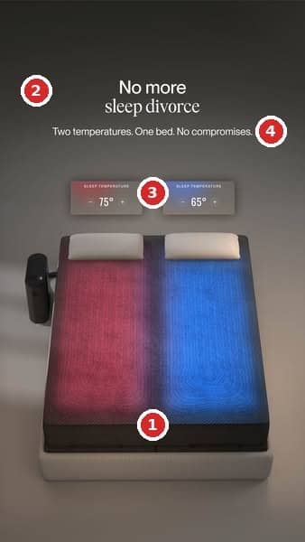
One bed, split down the middle. The left half glows red at 75 degrees, the right half blue at 65. That's the entire product story, told in the oldest color code humans have. Nobody's ever needed a legend for red and blue.
And look at what that spares the copy. The ad never explains zones or sensors or how any of it works. Your eye gets the whole value prop in half a second, which frees every word on the canvas to do a different job.
Temperature is invisible. This ad turns it into something you can SEE.
Everything else in the frame is greyscale, so the gradient is the only color on the canvas. The one thing that makes the sale is the one thing in color.
## 2. The headline names an enemy, not a benefit
“No more sleep divorce.” Not “sleep cooler.” Not “personalized comfort for couples.”
A generic benefit headline has to build the problem before it can sell the solution. A named problem shows up pre-agitated.
This reader has already had the argument at 2am, already seen the phrase in a dozen headlines, maybe already lost a partner to the guest room. The ad gets to skip the setup and land straight on “you know exactly what this is.”
Even the type is in on it. “Sleep divorce” is set in an elegant serif italic, like a phrase pulled from a magazine feature, because that's where the reader learned it. The headline is borrowing awareness the culture already paid for.
## 3. 75 and 65 make the promise concrete
Those two little control cards could have said “his side” and “her side.” Instead they show numbers, ten degrees apart, styled like the app interface.
The numbers turn the claim into something that feels like a product fact instead of ad talk. And the ten-degree spread quietly dramatizes the fight: these two people aren't just a little different, they're in separate CLIMATES.
And because those numbers are wrapped as UI, they tell you this is settable technology and a unique mechanism. That's a whole explainer paragraph the ad never had to write.
## 4. The subheadline stays focused
“Two temperatures. One bed. No compromises.”
That's the entire supporting copy. Now count what's missing: no sleep tracking, no smart alarm, no app screenshots, none of the other ten things this product does.
Eight Sleep sells the Pod, a smart mattress system that heats or cools each side of the bed independently. That's their hub sitting bedside, doing the plumbing. The spec sheet is long. The ad spends none of it.
Instead it aims at the exact fear the headline opened: that one partner has to lose for the other to sleep comfortably.
## How I'd Beat It
Two tests I'd run against this control.
**Put the couple in the headline.**
“No more sleep divorce” works hard, but only on people who know the term. I'd test the lived scene instead: “She sleeps at 65. He sleeps at 75. Same bed.” The control borrows awareness; the variant manufactures it on the spot, and it turns the two temperature cards into the headline's proof. If the trend name is doing the selecting, the control holds. If the argument itself is the hook, the variant opens up everyone who's never heard of sleep divorce but has definitely fought about the thermostat.
**Give the bottom third a job.**
Everything below the bed is empty dark space. Some Meta placements will obstruct whatever you put there, but not all of them. So it’s worth putting *something*there. My pick would be the logo, but you could also pull proof from Eight Sleep's own homepage: up to 44% faster sleep onset, up to 45% less snoring, a 30-night risk-free trial.
---
Minimal statics like this look like the easy thing to make, but they only work when the problem is named and the visual can carry the mechanism. Finding that balance is the part generic AI ad makers can't do for you.
---
**Want this done for your brand?**
One call will show you where your creative is leaving money on the table.
[Book a call](https://cal.com/colinelefante/ad-oven-discovery-call)