The Breakdown
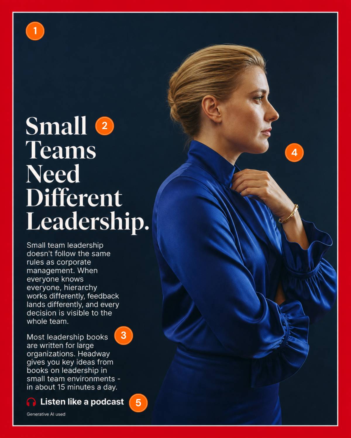
The Fake Time Cover That Borrows 99 Years of Trust
Back in 1983, David Ogilvy made a revealing observation:
Colin Elefante-Smith · 2026-07-27 · 3 min read
Back in 1983, David Ogilvy made a revealing observation:
"Roughly six times as many people read the average article as the average advertisement."
His fix was blunter than the stat. "There is no law which says that advertisements have to look like advertisements. If you make them look like editorial pages, you will attract more readers."
Headway took him literally. They didn't just make an ad look like an editorial, they made it look like one of the most recognizable editorial formats on earth.
## 1. The stolen border does the targeting
That red frame has wrapped every Time cover since January 3, 1927. Time has broken it five times in 99 years. Five.
Headway borrowed all of that pattern recognition for free. And recognition is the filter here: recognition is the bouncer at the door, and only readers get past the rope. Pew studied 30 major outlets last year and the prestige editorial brands owned the most college-heavy audiences in media (The Atlantic topped it: 62% hold degrees vs 36% of US adults). The format IS the targeting.
## 2. The headline is a callout dressed as a thesis
"Small Teams Need Different Leadership" reads like an editor's argument, but it works like a callout: if you manage five people, that sentence is about your Tuesday. That's the problem beat of a textbook problem-agitate-solution ad, set in Time's own familiar serif.
## 3. One line disqualifies every competitor
"Most leadership books are written for large organizations." Feel what that does? Every leadership book on your shelf, every management podcast, just stopped applying to you.
The advice in those corporate management books was never written for you. That's the agitate move, and it pre-frames Headway as the obvious solution.
## 4. The portrait is a mirror
She's not a customer, she's the reader five years from now: composed, tailored, unbothered. This cover is a TEMPLATE for who you can become.
Headway is a microlearning platform that condenses bestselling non-fiction and personal development books into 15-minute text and audio summaries. Not surprisingly, their TAM is MASSIVE.
Yet they do an incredible job of niching down into dozens of audience segments, which is probably why they're currently running 1,789 active ads in Meta's US Ad Library as I write this. You can be sure every one of those ads is as hyper-targeted as this one.
## 5. "Listen like a podcast" kills the last bit of friction
Not "download the app," not "start learning today." The CTA anchors to a habit the reader already has. No extra discipline required.
## How I'd beat it
Two tests I'd run against this control.
**Deepen the disguise.**The cover skips Time's furniture: an issue date, the little cover lines in the corner. The whole mechanism is pattern match, so I'd test the full set dressing and see if a deeper illusion buys a longer read.
**Open a loop.**The body copy resolves everything, problem straight through solution, no loose ends. Nothing unanswered is pulling the click. I'd test copy that teases the argument instead of finishing it ("the first rule breaks everything corporate management taught you"). The ad's job is selling the click. Let the next page sell the app.
Here's the thing... the cover itself took someone an afternoon. The AI tag at the bottom admits that. The strategy is what's underneath: one persona carved out of "everyone who reads," a complete problem-agitate-solution argument in 60 words, a CTA anchored to an existing habit.
---
**Want this done for your brand?**
One call will show you where your creative is leaving money on the table.
[Book a call](https://cal.com/colinelefante/ad-oven-discovery-call)