The Breakdown
The supplement ad that opens like a recall notice
Every brand past a certain size has a crisis statement sitting in a folder somewhere. Legal has already reviewed it. It opens the same way every time.
Colin Elefante-Smith · 2026-07-29 · 4 min read
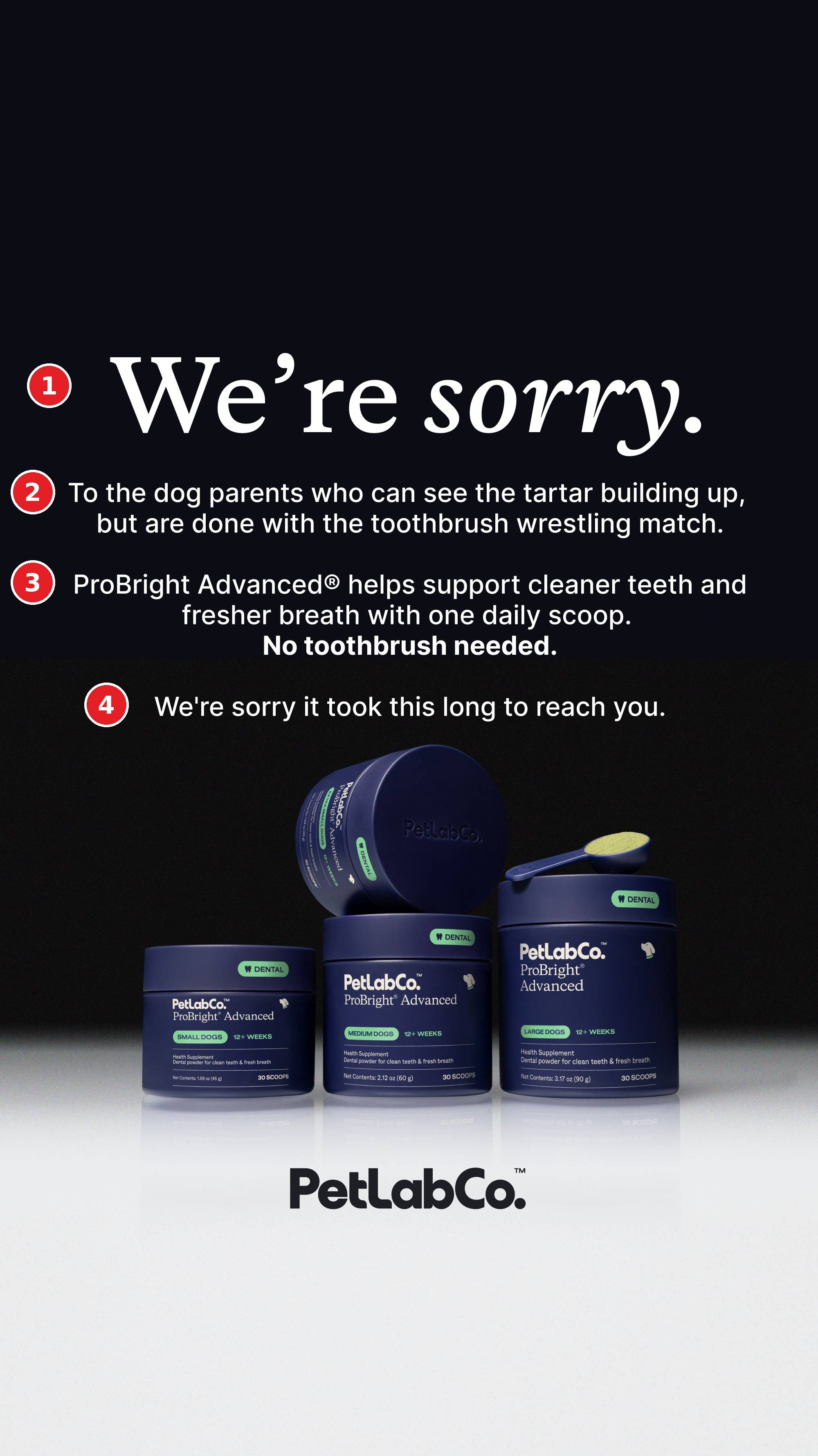
Every brand past a certain size has a crisis statement sitting in a folder somewhere. Legal has already reviewed it. It opens the same way every time.
*We're sorry.*
Those two words have exactly one meaning in a feed, and it has nothing to do with selling. A recall. A data breach. A founder who said something on a podcast. When they show up at 200 point type on a black background, your thumb stops, because you think you're about to watch somebody bleed.
So PetLab Co put those exact words on this dog supplement ad.
## 1. The copy is the hook
Look at what's in the top third. No product, no offer, no dog. A serif headline on black, and that's it.
It doesn't need anything else. Every brand apology you've ever read already did the conditioning for you, so your brain files those two words under "something went wrong" before you've decided to read anything.
That's the trade. PetLab gets a free scroll stop, and in exchange it owes you a payoff.
## 2. The apology doubles as a callout
"To the dog parents who can see the tartar building up, but are done with the toothbrush wrestling match."
Read the first three words again. The apology is addressed TO somebody, and that somebody is the buyer. It converts a piece of crisis theater into a straight audience callout.
It's the problem beat of a problem-agitate-solution ad. It just showed up in disguise.
## 3. The agitation comes from real customer language
"...done with the toothbrush wrestling match."
No marketing team brainstorming session produces that phrase. It comes out of reviews, support tickets, or somebody describing an actual Tuesday night. Anyone who has tried to brush a dog's teeth doesn't just read that line, *they relive it*.
Now look at what resolves it three lines down.
"No toothbrush needed." Bolded, sitting on its own.
Same idea twice. Once as the pain, once as the relief.
PetLab Co is a direct-to-consumer dog supplement brand founded in London in 2018, and ProBright Advanced is a dental powder you scoop onto food. The entire angle is "you don't have to do the thing you hate."
They're working this promise hard elsewhere too. The same benefit runs in their Ad Library as "Science backed dental care. Zero brushing." and "Mom reveals secret powder to clean dog teeth fast." Same benefit, three completely different doors.
## 4. The last line closes the loop
"We're sorry it took this long to reach you."
You get an opening that promises a crisis, and the answer is a mild joke about ad delivery.
It does a job. The loop closes and you don't feel worked.
The design underneath it is even more subtle than the line. Black at the top where the dread is, washing out to white where the product sits.
## How I'd beat it
Two tests against this control.
I'd test a version that pushes on the pain more. "We're sorry to every dog parent who..." and then list everything they've been living with: the breath in the car, the vet quote for a cleaning, the dog that bolts the second it sees the brush, etc.. Only then the turn. The stop is proven. The open question is how much agitation you can fit into the body.
I'd also make the picture carry the agitate. Right now the copy does all the persuading and the image is a product hero. The best line in the ad is a scene, and nobody drew it. I'd test the same copy over the actual wrestling match, or the actual tartar, and see if the visual can take some of the load.
It's obvious that somebody read enough of their own customers' language to write this ad. Prompt any image model and you'll get the clean render and the gradient. But you won't get the line about the "toothbrush wrestling match"
---
**Want this done for your brand?**
One call will show you where your creative is leaving money on the table.
[Book a call](https://cal.com/colinelefante/ad-oven-discovery-call)